Lawyer Guy: The North Side
The North Side is the first test area for Lawyer Guy: Defender of Justice, an action-platformer set to be released sometime. I started developing Lawyer Guy in around 2008 as a joke, abandoned it for around 6 years, then started working on it again in late 2014. You can download it over at robwel.ch/lawyer-guy!
I may write another article about Lawyer Guy’s structure later on, but right now I want to focus on the design and implementation of The North Side – being the first playable area, it took quite a lot of work.
Visuals
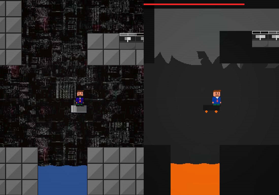
In mid-2014, Lawyer Guy looked like the left-hand image. Noisy and full of ugly colours. In late 2014, it looked like the image on the right. Rather than treating Lawyer Guy like a video game (I don’t have any experience doing art for video games!) I decided to treat it like a graphic design problem. It keeps roughly the same dimensions and proportions for every enemy, object and background, but it introduces a series of colour rules in order to add clarity and visual appeal.
1) Enemies shall be warm.
All of the enemies in the game have a warm colour palette, normally with red, orange or yellow highlights. The same goes for any object in the game that can damage the player, such as spikes. This reduces the amount of time the player has to spend looking at an enemy and increases the amount of time the player can spend thinking about them.
2) No two enemies shall have the same silhouette.
If the colours are going to be similar, then the player needs to be able to distinguish enemies by their silhouettes. I kind of cheat here, because there are two enemies with similar silhouettes (the eyeball and the spinning blade enemy) – but they have very different animations.
3) Enemy designs should give you a clue as to what they do.
For example, the floating eyeball enemy first protrudes brightly coloured spikes, and then fires them. The hopping enemy has a spring-loaded shaft that compresses when it lands on the floor. The ‘atom bomb’ enemy has a warning symbol on it, and is shaped like, well, an atom bomb, suggesting that it will explode. I break this rule here for the Floater enemy, which looks like it’s filled with liquid. I got no excuse, I just thought it was cool.
4) The background should be lighter than the foreground.
A lot of objects in the original Lawyer Guy could easily get lost in a background that is simultaneously dark and noisy. The flat, light backgrounds of the new version mean that the vividly-coloured objects and enemies have better contrast. Terrain that can be walked on is always the same colour (the darkest colour in the environment), so there’s no ambiguity there, either. The light backgrounds also help Lawyer Guy’s black bullets to stand out.
5) The game needs to give the player as much feedback as possible.
This is mostly done through animations. For example, when Lawyer Guy is hit, a white region appears on the health bar, lagging slightly behind his actual health. This shows the instantaneous amount of health that Lawyer Guy has lost, and also draws the eye toward the health meter, by creating an area of high (black-on-white) contrast. The same thing also happens to enemies that have been hit by a projectile. Additionally, when lawyer guy is hit, or when an enemy is destroyed, the screen shakes. This gives even more feedback, plus it’s fun seeing an enemy explode into bits. Finally, enemies that fire projectiles (mostly) have a long wind-up animation.
6) Be generous!
Lawyer guy actually has three separate hitboxes. The ‘platforming box’ allows him to stand a few pixels off an edge and not fall. The ‘sprite box’ registers some collisions that require pixel-perfect detection. However, for most enemies, he has a hurtbox that is actually a few pixels inside his sprite. As difficult as Lawyer Guy is, it’s important to make the game play fair, and I don’t see why Lawyer Guy shouldn’t get to teeter off an edge, or get grazed instead of killed by an enemy bullet.
Together, these elements make for a (mostly) crystal-clear and visually appealing game, albeit with very, very basic visuals. In future levels I will expand the colour pallette, level tiles, and backgrounds, but I’ve still tried to keep to these core ideas as much as possible.
Level design
I had not designed a video game level before Lawyer Guy. Well, OK, I had designed some levels, but I had never really properly thought about what I was designing.
Stealing the terminology from this article, Lawyer Guy levels are divided into so-called ‘Rhythm Groups’. Each group contains a particular, self-contained mix of gameplay elements, and tests a particular skill. It’s useful to group game levels like this, rather than designing them as whole entities, because it allows you to jot down sketch-like ideas for cool areas first, and worry about how they’re all going to fit together later on. It also means you don’t have to design any part of the game in any particular order: it’s much easier to design a bunch of these groups, then pick out the ones you find a common theme in and call them a level.
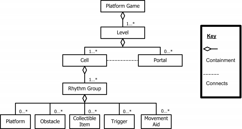
Conceptual model of Smith et al’s level framework. The linear nature of Lawyer Guy levels means cells are not really part of the design yet, although a non-linear hubworld is planned for the game.
I design every area in lawyer guy on paper first. Sometimes in MS Paint or Pinta first, but always as a drawing. Then I dump all of them into a huge folder, and when I have enough, I start piecing together a level out of them. Because this was the first level I’d designed, I wanted to show off everything that I’d put in the game up until that point, but that was actually a pretty bad idea, and I ended up having to scale it back a bit. Subsequent levels got more focused.
So, then, some rules of level design.
1) Be a Jerk
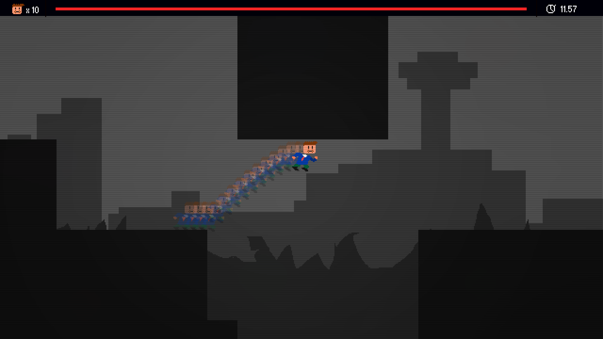
This is something that Zelda II: The Adventure of Link taught me. That game is a jerk. It’s OK to be a jerk. Obviously, you shouldn’t just kill the player for no reason. But you should look out for ways to catch them off-guard whenever possible, try and throw them off-balance, or play games inside their head. There’s a few examples of this behaviour in the North Side. Here:
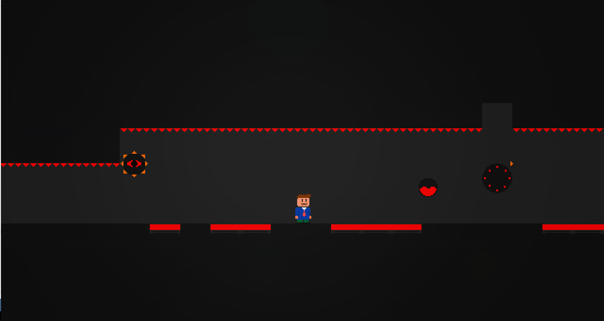
This is the first thing that the player meets after they’re done with the tutorial. A vertical down a pit lined with spikes. Anyone who’s played Mega Man (by which Lawyer Guy is heavily inspired) will be preparing for the path to snake left and right, so naturally, they’ll go and stand in the middle. This is but the beginning of Lawyer Guy’s clever mindgames! The path actually splits into two, and anyone in the middle will find themselves skewered on spikes. It happens very, very early in the level, so players will only lose 10 seconds of progress or so (if that), but it’s a warning shot: this ain’t your grandmother’s Mega Man.
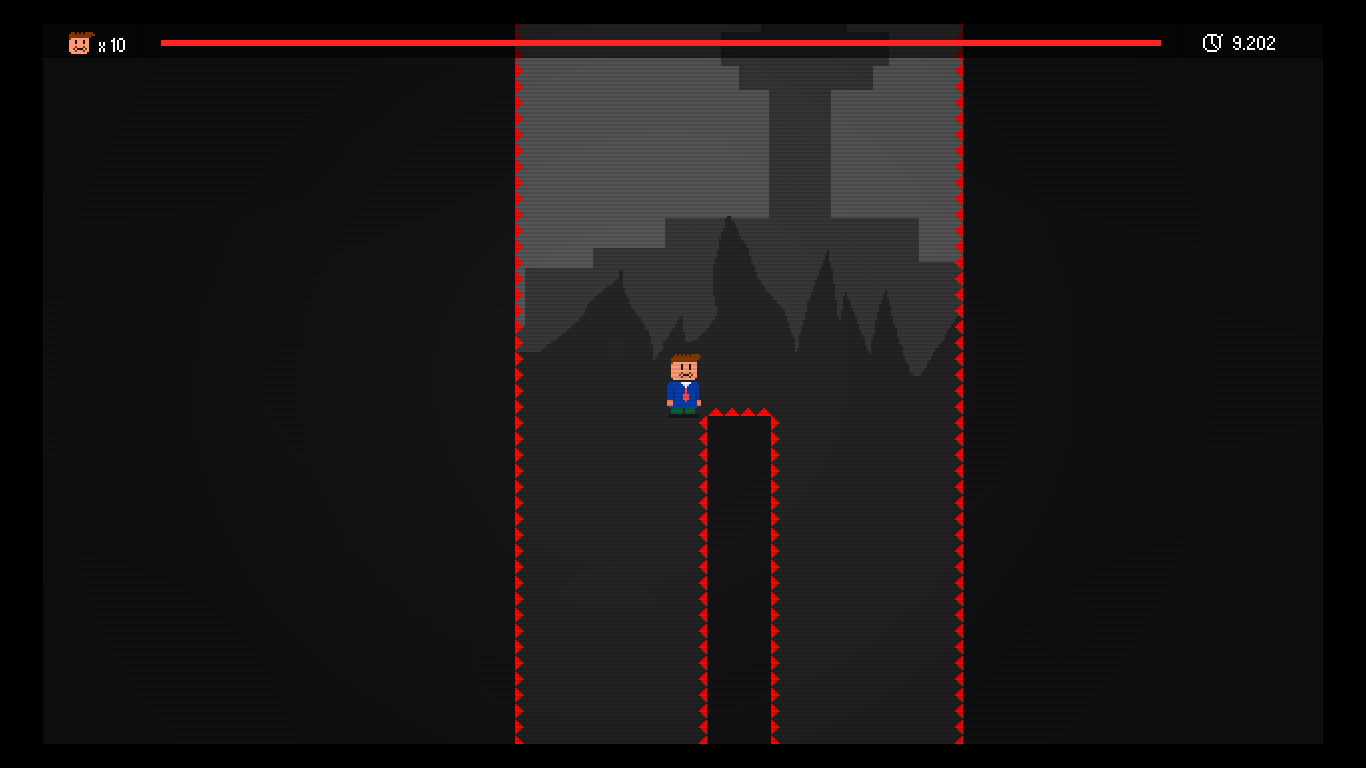
Another bit of mindgames comes in here. When the player falls down this hole (which is quite easy to fall down), they discover an elaborate secret passage. If they follow the passage, they end up in…
The bottom of a spike pit. Expectations are broken. This AIN’T your grandmother’s Mega Man.
I believe that level design, on its own, with no words, no nothing, can be funny, and this is a favourite nonverbal joke of mine. Zelda II is full of these, by the way.
Finally, if the player does reach the end of this segment, rather than ending up on solid ground, they have to do one more tricky jump and dodge one more enemy, an enemy that’s placed in a very awkward spot. This rhythm group has kind of a false ending, if you like. It’s one last way to try and throw the player off-balance. All video game levels have a natural rhythm to them, whether the player notices it or not, and players immediately know if something is off. And this? This is off.
2) Don’t be too much of a jerk.
The player should feel amused or challenged by your jerkiness, but they have to feel like it’s their fault when they die. For example, you should not introduce any element faster than the player can understand it. The dash mechanic is essential to this level (although it can be beaten without it, with a lot of difficulty). The starting area of the level contains a jump that the player can’t make without both using the dash, and understanding that they can chain a dash and a jump together in order to make very large leaps.
Similarly, the spring enemy is the most common enemy in the level, but it’s introduced in pure isolation, in a situation that demonstrates its movement capabilities, and it’s only mixed with other enemies and objects when it’s certain that the player has understood how it works.
3) Focus on emergent complexity, not designed complexity.
Enemies and objects should not have overly complex behaviours. They should be easy for the player to understand, and non-verbally at that. Then, when they’re combined in different ways, they create entirely new gameplay situations. This has another advantage: a savvy player will be able to work out what’s going to happen in a particular area as long as they know all of the different ingredients.
I was still learning level design when I made this level, and emergent complexity is probably the thing it does worst. I will pick a segment in which the game does it well:
If there were just the spinning blades, the player would only have to wait until they saw an opening and run through. But there’s a walkway of holo-blocks leading up to them. This means that the player can’t wait right next to the blades, or they’ll fall through the blocks and die. So they have to make sure that they get on the holo-blocks in the right cycle of the spinning blades. But – ah! Phooey! The player doesn’t have time to do that either, because as soon as they approach, an enemy spawns in front of them! This means that, in addition to precisely timing their approach to the spinning blades, they have to keep moving, make sure not to fall through the blocks, and either avoid or destroy an oncoming enemy, bearing in mind the effect that doing so will have on the blade cycle timing. All-in-all, it’s a complex gameplay scenario that very few players will beat on the first try (or even the second try). But made from very simple, predictable components.
Feedback from Testers and Edge Cases
Designing objects for 2D video games is not as easy as I thought it would be. There are a lot of edge cases. Some of the ones in Lawyer Guy still make me cringe, particularly to do with objects I designed 6 years ago. The movers (like vertical platforms and boxes) require a special case of Lawyer Guy’s animation system that basically re-implements all the animation logic. The hopping enemies will sometimes get stuck in a wall or floor. They are canonically crappy robots, so I decided I would roll with it and just make them spontaneously explode – but that’s why they do it! The spinners can only go at one speed, because they change direction based on the number of frames that have elapsed since they entered a certain grid square. The sound effects for the holo-blocks still don’t trigger at exactly the right time. And one eagle-eyed playtester sent me the following screenshot:
Hear me out on this one. Lawyer guy’s hurtbox is much smaller than his platforming box. But because the spikes are always up against the wall, it means that, if they were triggered by lawyer guy’s hurtbox, he’d never be able to collide with them, because his platforming box would stop him. So these are one of the few objects in the game that are tied to his sprite instead (expensive!). But this presents another crazy problem! He can stand on nothing right next to these spikes and not get hit!
Lawyer Guy’s design has edge cases. Lots and lots of edge cases. It is very hard to make one rule fit in all situations. And most of them are things that you literally never think about while you’re playing games! For example: in a traditional Mega Man game, enemies do not exist until the camera touches their spawn point. Once that happens, the game spawns an enemy. If they move off the screen, they disappear, and if the camera touches their spawn point again, they spawn again. Simple. But this means that the level design of the game is intrinsically tied to the aspect ratio and resolution of the viewport!
After playing ‘Shovel Knight’, by Yacht Club Games, I was sold on the idea of expanding Lawyer Guy’s ‘traditional’ 4:3 aspect ratio into a 16:9 one. Not only would it leave more room for some of the more complex layouts in the next level, it would also allow the game to scale to the entire size of a 1080p screen in integer pixel scaling mode. The problem? A wider viewport means the viewport touches the enemy spawner EARLIER than it does in 4:3 mode. Consequence? All of the enemy spawns have to be manually repositioned to make sure that the level plays the same.
Another example: A playtester told me he thought the game would be good for speedrunning, but wondered if I could put some game objects on local cycles instead of global cycles. For reference, this distinguishes between ‘objects that exist and start doing their thing the minute the level loads’ to ‘objects that only appear when they get into frame’. Most of the non-enemy objects in Lawyer Guy are currently on global cycles. This means that most of the time, when the player approaches them, they don’t know what state these objects are going to be in, so it adds a semi-random amount of ‘waiting time’ – bad for speedrunning! But putting these objects on local cycles creates a problem. If they spawn in on camera movement, they could spawn in different times depending on when the camera touches the spawner, making their cycles inconsistent and out-of-sync with one another. If they’re grouped together into ‘spawn groups’, they need a manually-defined spawn trigger and manually-defined spawn logic, which is the kind of thinking that will end in me bloating my game with useless logic. In other words: it’s intrinsically inelegant. The best solution I can think of is to break levels into smaller chunks, each with its own global cycles. But I don’t like that approach. I like continuous levels with slick camera transitions. The only reason the NES had levels broken up like that was because you needed special hardware to swap out chunks of the level in realtime, or scroll in two directions at once, or you needed a transition to swap out the pallette. In other words, it was a technological limitation, like sprite flickering, there’s no reason to hold onto these remnants of the past.
No, I’ve still not found a good solution to either problem.
Camera
Speaking of ‘things invented because of technological restrictions’ and also ‘things you never thought would be so complex’, I do have to mention Lawyer Guy’s camera system. Lawyer Guy uses a hybrid free\on-rails\fixed camera system. In free camera mode, the camera stays fixed to lawyer guy’s sprite 100% of the time, including while he’s jumping and falling. Not everybody likes this ‘direct camera’ mode. If you look at other games with cameras like this, you’ll notice that there are a few extra behaviours that developers like to add. The first is to keep the camera’s x position fixed while the player character jumps. This works great if the player is landing on a surface that’s of a similar height to the one they came from, but bad in other cases, because the camera then needs to track quite a large distance. If the player is making large jumps with the camera in this mode, the camera also needs to set a threshold for starting to track the player again. If you look at a game like Super Mario World, the camera system is very complex, has a lot of edge cases, and often switches to pre-defined camera rails anyway.
Another design pattern common to platformer free cameras is that they don’t follow the player exactly on the x-axis. Sometimes, the camera will define a ‘grey zone’ in the center of the screen, where the player can move without triggering camera motion. This is tolerable, provided the grey zone is only behind the player, not in front of them. But it begs the question: what’s wrong with moving the camera? Why does it have to stay still at every possible opportunity? If the game world is fixed and only the player moves, the state of the camera is predictable, the player knows where to look at any given moment, they know what’s going to be where on the screen and when. The same is true if the player character is fixed and the game world moves: the player knows how the world will move, and when, and they have complete control over it. But when you design a hybrid system, suddenly you introduce all of these edge cases, and for the edge cases, you introduce complex camera behaviours that might not be so easy to predict. And so the player has to mentally ‘adjust’ when the camera switches between these modes. They are no longer in complete control of the camera. Unless your camera system is Super Mario World levels of perfection, it’s going to be jarring to someone.
The one ‘camera trick’ I was tempted to pick up is from games like the original ‘Rayman’, which will anchor the camera slightly in front of the camera when they’re walking forward, and slightly behind the camera when they’re walking backward. This means that the player’s ‘useful viewport’ is expanded. The reason I didn’t implement this behaviour comes down to enemy spawns. It means that the camera position depends not only on the position of the player, but on the camera’s ‘inertia’ (well, that’s one thing to call it). So an enemy could spawn later for a player who has just turned around than one who has already been moving in the same direction for a while. Not being able to guarantee an enemy’s spawn time relative to the player’s location could put the player in impossible situations, or it could allow them to cheese a difficult section by skilfully manipulating the camera. Neat. But not the gameplay we want!
Nevertheless, there are many sections in Lawyer Guy that are either vertical-only or horizontal-only. In these sections, it is useful to have the camera track along a rail, as it keeps more important information inside the viewport at once. For these segments, I defined a ‘rail axis’, which has its own collision box, which could be either a vertical or horizontal line of any length. When the player enters the box, the camera snaps to the relevant axis to the rail with an ‘ease in’ transition. There are also ‘fixed point’ camera areas, which work the same way, but fix the camera in both axes.
Example of the Lawyer Guy ‘camera on rails’ system, switching from free camera mode to horizontal rail mode, to another (higher) horizontal rail, then to vertical rail mode.
A word on Lawyer Guy’s inspirations: some aspects of Lawyer Guy but particularly the play control, are heavily, heavily inspired by Capcom’s Mega Man games from the late eighties and early nineties. Some of the games that have imitated Mega Man since have used the camera and scrolling logic from those games pretty much verbatim. This means two things: no free scrolling and no vertical scrolling! All of the vertical sections from Mega Man are actually fixed camera areas stacked on top of one another, separated by long scrolling animations that play whilst the game is loading and unloading data from the NES’s RAM. Although truly vertical sections were technically possible using this setup, they were always designed in a kind of discontinuous way, or kept very simple. True verticality actually opens up a lot of interesting possibilities, which Lawyer Guy fully exploits.
Closing Thoughts
I hope this gives you some insights into the hidden depths of video game design. Most of the stuff I’ve talked about here is the baseline ‘how to make a game that’s not bad’ checklist. It’s the kind of thing that most players won’t even notice. But so much thought has to go into it! Next time, I will hopefully be talking about some of the features of Lawyer Guy that distinguish it from other platformers, and some of the bits of design that I’m most excited about.
If you’ve found all of this interesting, you can download Lawyer Guy for yourself over at robwel.ch/lawyer-guy.
Last updated August 21, 2017.